| |
|
||||||||||||||||||||
|
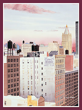
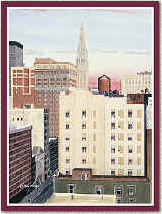
In “Chelsea I,” a magnificent pink cloud streams across the building-tops, connecting a tall skyscraper – its tip cut off by the top of the composition – to a squat industrial structure with a face enlivened by many windows. Here, too, other fiery hues play along the edges of distant office towers, reminding us that the beauty of nature cannot be suppressed by the |
|
most mundane urban structures.
But in this painting, as in all of Mundy’s aquarelles, the
artist also draws one’s attention to the subtler pleasures of pure
space and light. Mundy is
so in control of the elements that make up his compositions that he
never allows their more picturesque elements to upstage their quieter
formal aims. He is a
consummately cerebral painter who will not be seduced by easy pictorial
solutions. Indeed, his spatial solutions are marked by an almost
Mondrian-esqe stringency. | |
|
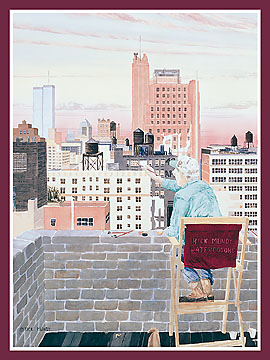
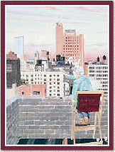
At the same time, Mundy can be playful and
a touch surreal, as in Chelsea IX,” where he introduces the figure
of a painter (presumably a self-portrait), looming on the right side of
the composition and leaning over a balcony to put the finishing touches
on one of the buildings clustered beyond. But this picture is something a an anomaly, apparently introduced
to prevent anyone from summing up his art too easily, and the artist’s
more pressing concerns come across in his handling of form, space, and
color. |
|
|
|
|
|
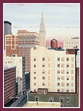
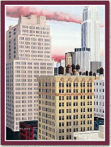
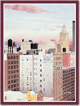
In this regard, one of his most compelling compositions is “Chelsea VII,” where the darker-hued buildings and rooftops in the foreground create a dynamic contrast to the lighter facades in the middle distance and the skyscrapers on the horizon, set against a pink-tinged sky. Here, Mundy treats his subject with the cool dispassion of a table-top arrangement of bottles by Morandi. His austere forms and muted |
|
|
colors create a beautifully balanced
aesthetic experience. |
|
|
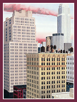
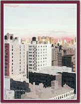
In other paintings, such as “Chelsea IV,” and “Chelsea III,” Mundy creates great visual interest with the varieties of architectural ornamentation, color, and texture that characterize the different buildings. |
|
|
He depicts each particular façade with the care of a portrait
painter, conveying the “personality” inherent in every structure
with an almost anthropomorphic attention to detail. |
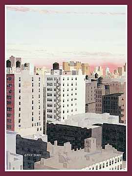
In virtually all of Mundy’s aquarelles,
skies provide expressive foils to the formal function of the
architectural elements, casting light that suggests transcendence and
projecting chromatic relief to the organizational stringency.
These stratospheric expanses allow the composition to breathe,
yet their inherent drama is kept in check by the artist’s ability to
balance a picture exquisitely and provoke effects that are at once
dramatic and restrained. In
this way, too, Mundy shares qualities in common with the late Fairfield
Porter. Both are painters
who walk a tightrope between contradictory aesthetic impulses with
extraordinary grace.
In Rick Mundy’s case, the fact that he employs watercolors makes his work all the more remarkable. This is a medium that American artists like John Marin and Charles Burchfield once used to create major pictures, but very few artists in recent decades have been able to use the medium effectively. Mundy, however, demonstrates that the particular qualities of aquarelle – its clarity and transparency – can add special beauty to certain subjects and, in the hands of someone who can master the medium’s inherent difficulties, watercolor can sustain serious aesthetic statements. For these reasons, among others, Rick Mundy is a valuable and compelling painter.
Howard Farber
![]()